
I let a daffodil, a flat white, and two hours in a coffee shop design this brand. An art-led packaging design passion project.
- Mar 18
- 4 min read
Updated: Mar 29
I've always wanted to see my artwork in new places. On walls, yes, but also on objects. In spaces. On the things people pick up and use every day without thinking twice.
After a recent trip to Paris seeing beautiful and exciting coffee shops on every corner, it sparked something within me, so I decided to scratch the itch. Packaging being one of my favourite areas of design felt like an obvious place to start.
Introducing, Fleur.
The Starting Point
There was no client brief. No mood board. No folder of references saved for a rainy day. Just me, a sketchbook, a coffee, and one simple rule I set for myself: everything had to come from what was physically in front of me. The colour palette, the logo, the artwork all had to come from whatever caught my eye then and there.
The time pressure was intentional. I gave myself the afternoon because I wanted to stay in that quick, energised creative headspace where you don't second-guess anything. You just respond to what's around you and see what comes out. I wanted to be strict on the time here as well to prove to myself that it is possible to turn something around in a fun, quick, and sharp way without overthinking and allowing the flow state to happen. No second guessing ideas, no fear, just flow.
Where the Name Came From
A single daffodil in a little glass on the table beside me.
I'd been sitting there thinking about what kind of coffee brand felt genuinely different, not just visually but in its whole reason for existing. And then I looked at that daffodil and the idea just arrived. What if a coffee brand was built entirely around floral-noted beans? Not coffees that happen to have floral notes buried in the tasting profile, but a brand where that's the entire point. Every roast, every origin, chosen specifically because it blooms with floral flavour.
Fleur. French for flower. It felt right immediately.

The Artwork
Now here is where it gets interesting. I painted the daffodils digitally then and there, loose and gestural, the way I always work when something is exciting me and feels super in the moment. Bright background, bold yellow, orange and white petals, little flecks of white across the composition. It's fast and full of energy and it felt like the right painting for this.
Cropped and placed onto the kraft pouch, it became a window into the artwork rather than a graphic. That's the thing about putting original paintings on packaging, it stops the product looking designed and starts making it feel inevitable. Like it was always meant to be that way.
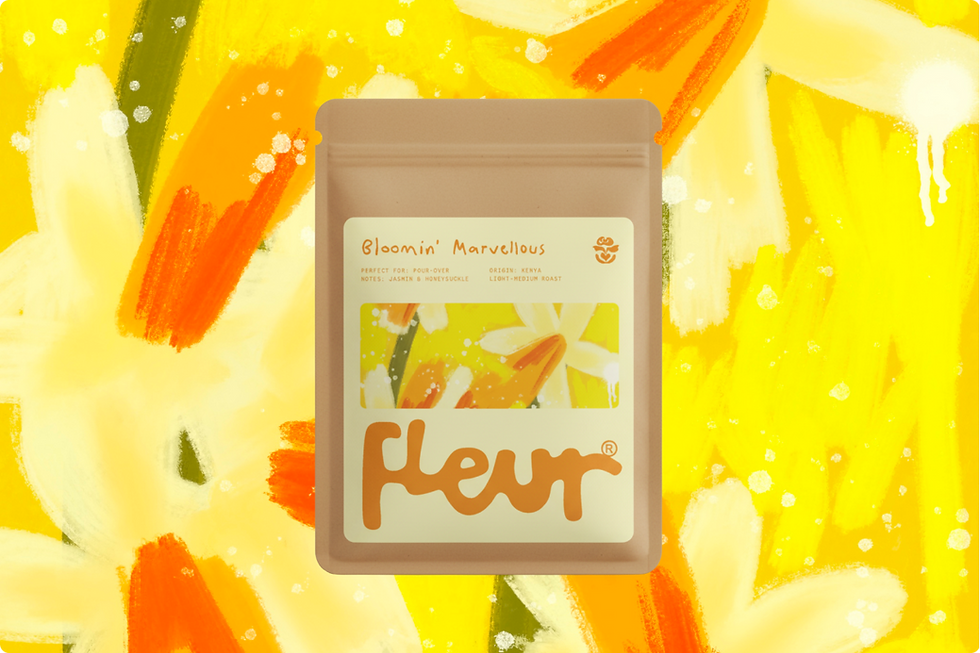
I decided to name this blend 'Bloomin' Marvellous', just because. "Bloom" like a flower, but also because "blooming" is what you allow coffee to do in pour-over, the perfect serve for coffee with this flavour profile. A light-medium roast from Kenya, jasmine and honeysuckle notes.
The Logo
The flat white I ordered came with the most beautiful latte art, a rose poured in milk. I sketched it straight away. That sketch became the Fleur icon: a simplified floral form with a small heart inside it, the kind of mark that works equally well as a stamp, an embossed detail, or a quiet accent beside the wordmark. No overthinking, just a spark of inspiration and confidence to stick with it.
The wordmark is rounded and bubbly, lowercase, friendly without being naive. It doesn't shout. It blooms. I wanted this to mimic the flow and form of milk pouring.


The Colour World
The bar was tiled in soft sage green. The light was warm amber. The whole room felt earthy and considered without trying to. I pulled that warmth directly into the Fleur palette: a soft cream-yellow label, deep amber type, kraft brown packaging. Warm without being heavy. Joyful without being loud. The colour palette allows the artwork to take centre stage.
What Art-Led Brand Design Actually Looks Like
Fleur doesn't exist as a real brand. But making it taught me something I want to keep coming back to.
This is what art-led brand design looks like in practice: when artwork genuinely leads a brand's visual language, not added in at the end as decoration but present from the very first decision, everything starts to cohere differently. The colours feel more alive because they work with a painting. The name feels more connected because it came from the same place the painting did. The whole thing holds together because it grew from one real moment rather than being assembled from parts.

That's the kind of design I'm interested in. Art and design working together from the beginning, each one making the other better. If you're a brand founder looking for that kind of creative partnership, I'd love to hear from you. And, if you're a creative who wants to try this yourself: find somewhere you love, take a sketchbook, give yourself two hours, and only use what's in front of you. You'll be surprised what you come up with!
Mitson is an artist and art-led design studio based in Edinburgh, working at the intersection of art and design. You can follow along for more insights behind my art-led design studio mitsondesign.com
Comments